MRS. DOPICO'S ART CLASS
  • Home
  • Remote Class Policies and Procedures
  • Studio Art 6th Period
    • Color Theory
    • Form Still Life
  • Foundation in Media Arts
    • Personal Collage
    • Line Tile Paintings
    • Object Portrait
    • Value Landscapes
    • Abstract Collage
    • Color Theory
    • Form Still Life
    • Galaxy Painting
    • Appreciation Portrait
    • Picasso Portrait
    • Surreal Collage
    • Pixel Animal
  • Graphic Art and Design
    • Surreal Collage
    • Line Tile Paintings
    • Chimera Collage
    • Zentangles
    • Japanese Print
    • Picasso Portraits
    • Magazine Cover
    • Appreciation Portrait
    • Visual Pun Illustration
    • Storybook City
    • Low Poly Portrait
  • Fashion
    • Personal Style
    • Dresses
    • Seasonal Collection
    • 1910's
    • 1920's
    • 1930's-1940's
    • 1950's
    • 1960's
    • 1970's
    • 1980's
    • 1990s
    • Haute Couture Design
    • Product Design- Sneakers
    • Sunglasses Design
    • Merchandise Board- Repeating Patterns
  • Contact Me
  • Mrs. Dopico's Artwork

Character Selfie

Picture
Line Quality/ Contour Line

Line Quality in artwork is the varying thickness, thinness and style of all the lines in a drawing. This can also be called the weight of the line and the profile of the line. 

Artists will use various different line qualities to make their artwork more visually interesting and to avoid it looking too flat. 
You can show different textures, movement, light and space just by using different line thicknesses and lengths. 

You can achieve a push and pull in your drawing through line quality. Thicker lines come forward and thinner lines recede into space. This gives the drawing a sense of depth. 

Line Weight refers to the look of thick lines being "heavier" and thin lines being "lighter". 

Contour Line refers to the outlines in a drawing. We will choose the best lines to draw based on your photo of your face in order to best describe you. 
Character Illustration

Cartoons and Illustrations have been been around as long as the first cave paintings. Artists throughout time have had the desire to depict the world around them through their own personal styles, their own artistic hand. By creating a simplified drawing or a cartoon, the artist is quickly able to depict who or what they are drawing in the simplest but most recognizable way.

This is called stylizing: When artists create artwork that is anything but "realistic" they are doing something called stylizing. That means you take what you see in real life and translate it into art through simplifying the lines and shapes to make it your own. 

Any cartoon or illustration is stylized. Digital art lends itself easily to stylization and creating cartoons quickly and cleanly using Adobe Illustrator for the line work and Adobe Photoshop for the color. 
Picture
Picture


​


​loish.net/


Loish is Lois Van Baarle a contemporary dutch digital illustrator. All the work on this page is hers. She completes all her artwork using the exact programs we use in this class (and a digital tablet...) to achieve her work. Her artwork has varying line quality in order to give her characters texture, a sense of form, movement and a sense of energy. 

Picture

Assignment # 1

Copy and Paste the following questions into a NEW SLIDE in your google portfolios.
Answer the following questions in complete sentences. 

  1. What makes a cartoon character memorable and unique? 
  2. Choose an image of your favorite cartoon character. Paste an image of them onto this slide. 
  3. Which character did you choose and why? 
  4. Why do they look the way that they look?
  5. What does it mean when an artwork is stylized? 
  6. What is line quality?
  7. What is line weight?
  8. What are contour lines?
  9. Why do we use different line qualities and line weights in an artwork? 

Assignment # 2: Line Drawing

You are to choose an image of a person from the internet. (A portrait)

Copy and paste that image into a new file in Adobe Illustrator.

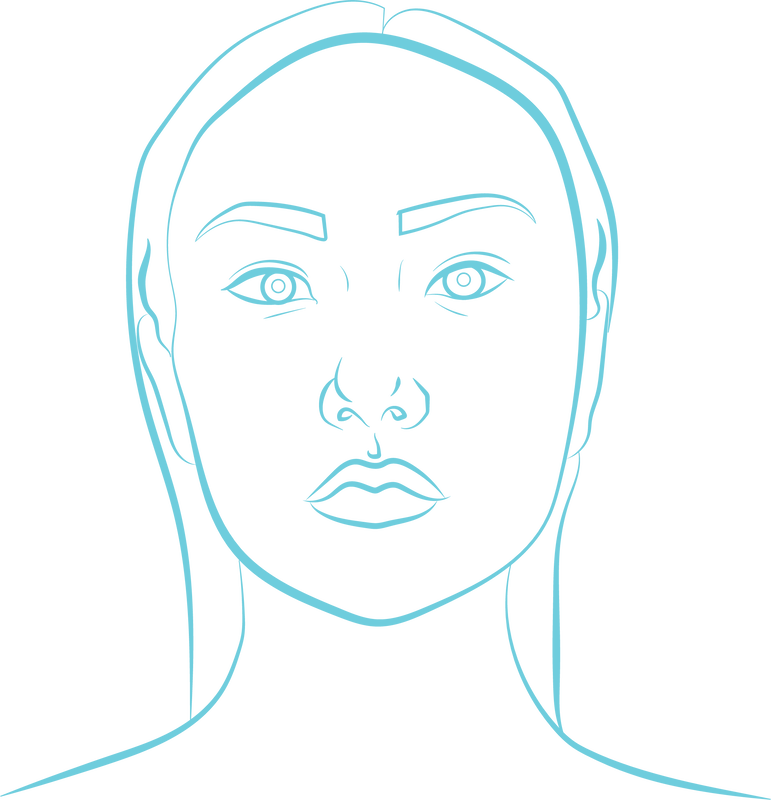
You will practice drawing/ tracing the contour lines of their face and manipulate the strokes that you create. Use the pencil tool and a  bright stroke color (no fill) so that you can see your work. 

This is preparation for you drawing your own faces for the next assignment. In the example to the right, I used only the pencil tool, to trace the contour lines. 

​When done, place it in your portfolio for a grade!

Reference the tutorial below underneath assignment # 3 on how to do this. 

Use the stroke panel and the pencil tool! 
Picture

Picture
Picture
Assignment # 3

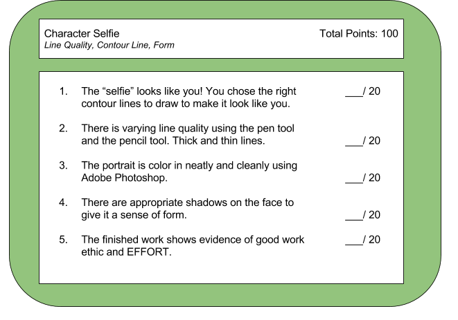
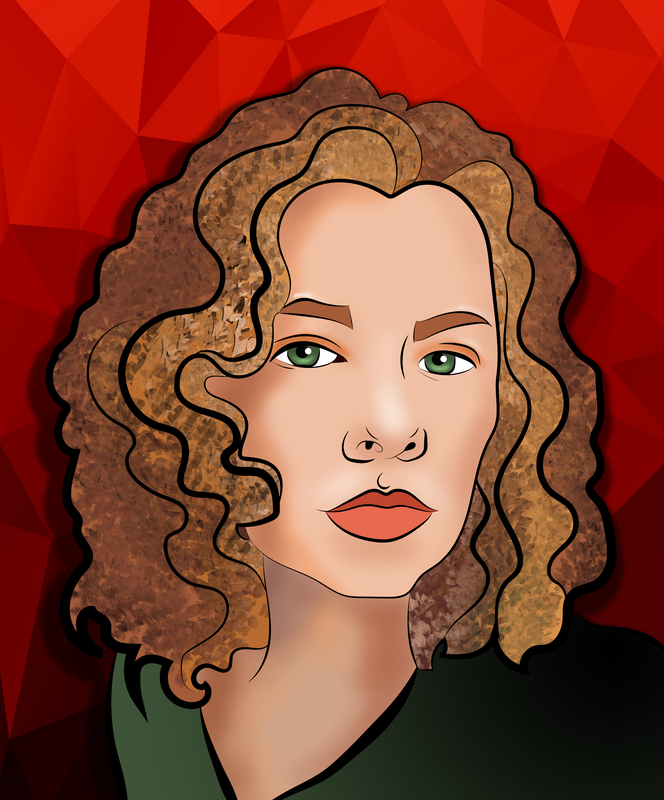
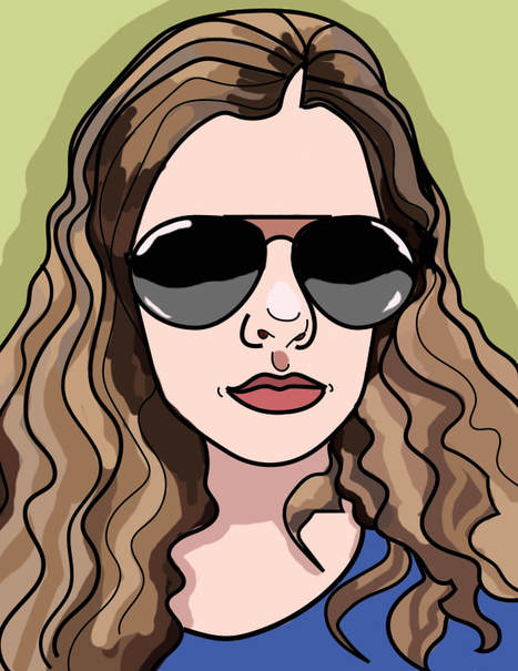
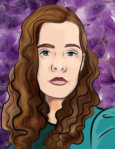
You are to create a self portrait, inspired in part by the artist Loish, in a cartoon illustrative style. It will be a close up of your face. (No full body)

It MUST have the following:
  1. It must look like you! 
  2. The line work must be completed in Adobe Illustrator using the pencil tool and/or the pen tool.
  3. It must have varying line quality. (Some thick lines and some thin lines) to give the drawing visual interest. 
  4. It must be colored in neatly and cleanly using Adobe Photoshop and the brush tool. 
  5. There are shadows where they should be in order to give your portrait a sense of form. (Darker skin tone as a shadow under the chin on the neck....etc)
  6. There must be a BACKGROUND using a combination of text and images. 
  7. The finished drawing must show evidence of good work ethic and EFFORT. 

​
TUTORIAL BELOW:
characterselfie.pdf
File Size: 13265 kb
File Type: pdf
Download File

adding_text.pdf
File Size: 1937 kb
File Type: pdf
Download File

adding_overlays.pdf
File Size: 1980 kb
File Type: pdf
Download File

Picture
Picture
​Self Reflection Questions: complete these when you are done! 
When you are done with your project, and it is in your google portfolio for grading, answer the following questions in the comment section underneath your slide:
  1. What do you think you did well in this project? (Be specific)
  2. What do you think you could improve on in this project? (Be specific)
  3. What did you learn how to do, or get better at doing in this project? (Be specific)
  4. Why did you choose the words that you did to describe you for your background?
Proudly powered by Weebly
  • Home
  • Remote Class Policies and Procedures
  • Studio Art 6th Period
    • Color Theory
    • Form Still Life
  • Foundation in Media Arts
    • Personal Collage
    • Line Tile Paintings
    • Object Portrait
    • Value Landscapes
    • Abstract Collage
    • Color Theory
    • Form Still Life
    • Galaxy Painting
    • Appreciation Portrait
    • Picasso Portrait
    • Surreal Collage
    • Pixel Animal
  • Graphic Art and Design
    • Surreal Collage
    • Line Tile Paintings
    • Chimera Collage
    • Zentangles
    • Japanese Print
    • Picasso Portraits
    • Magazine Cover
    • Appreciation Portrait
    • Visual Pun Illustration
    • Storybook City
    • Low Poly Portrait
  • Fashion
    • Personal Style
    • Dresses
    • Seasonal Collection
    • 1910's
    • 1920's
    • 1930's-1940's
    • 1950's
    • 1960's
    • 1970's
    • 1980's
    • 1990s
    • Haute Couture Design
    • Product Design- Sneakers
    • Sunglasses Design
    • Merchandise Board- Repeating Patterns
  • Contact Me
  • Mrs. Dopico's Artwork