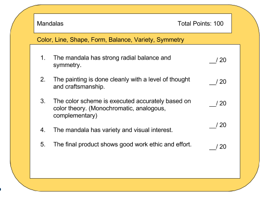
Color Theory
Artists use color theory when creating their artworks. It is a set of color guidelines that ensure that when you choose your colors for your artwork, you will have the effect that you want.
Color is the light that is reflected off an objects surface, color is that light that we see.
There are 3 main parts to a color:
- Hue: What the color actually is, the name of it (red, blue etc)
- Value: How light or dark that hue is.
- Intensity: How bright or dull that hue is.
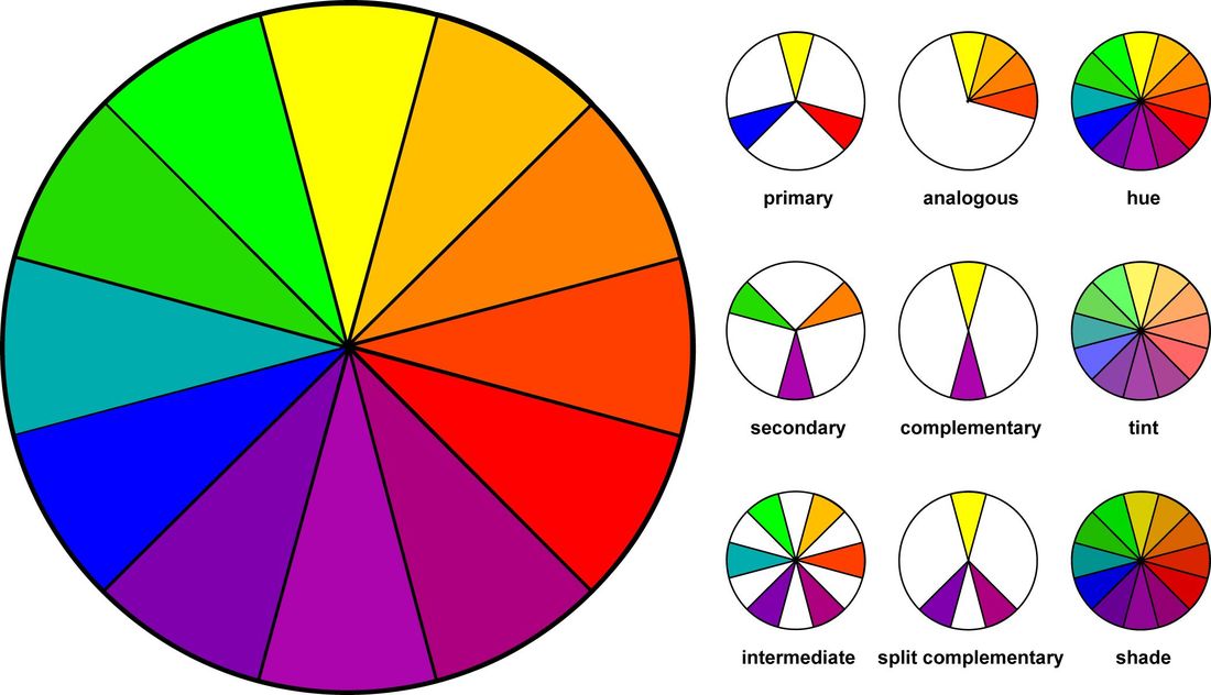
COLOR SCHEMES:
Primary Colors: red, blue and yellow. You can mix these 3 colors in different amounts to create all the colors on the color wheel.
Secondary Colors: green, orange and purple. These are the main 3 colors created when you mix the primary colors.
Tertiary/ Intermediate Colors: the rest of the colors to fill out the color wheel after you add the primary and secondary colors. You get them by mixing Ex. red-orange, blue-green.
There are 3 ways to alter a color:
Tint: pastels, when you add white to colors.
Shade: when you add black to colors.
Tone: adding grey to colors.
Monochromatic Color Scheme: lights and darks of one color. (ex: if it was a blue monochromatic color scheme, the artwork would be all light blues, medium blues and dark blues.)
Analogous Colors: These are any 3 colors that sit next to each other on the color wheel. You would use an analogous scheme if you want your artwork to have a sense of harmony.
Complementary Colors: These are colors that sit opposite each other on the color wheel: red/green, blue/orange, yellow/purple. You would use these color sets when you want things to stand out and have contrast. (Think about sports logos, they are usually complementary colors)
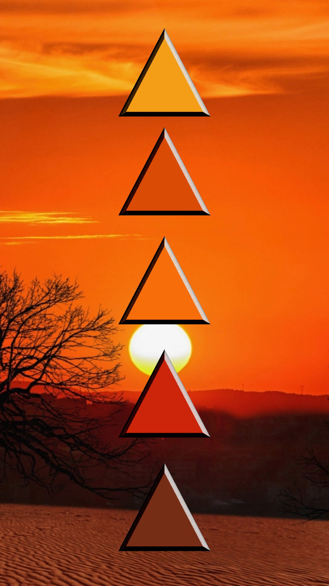
Warm Color Scheme: reds, oranges, and yellows. This gives an artwork feelings of anger, energy, excitement, etc
Cool Color Scheme: blues, purples and greens. This gives an artwork feelings of calm, sadness, peace etc.
Artists use these different color schemes to enhance the narrative of their work and to add emotion to it. By using specific color schemes, artists can control the feeling a viewer has when seeing their artwork.
Assignment # 1
Google Doc assignment on google classroom under the classwork tab!
Google Doc assignment on google classroom under the classwork tab!
|
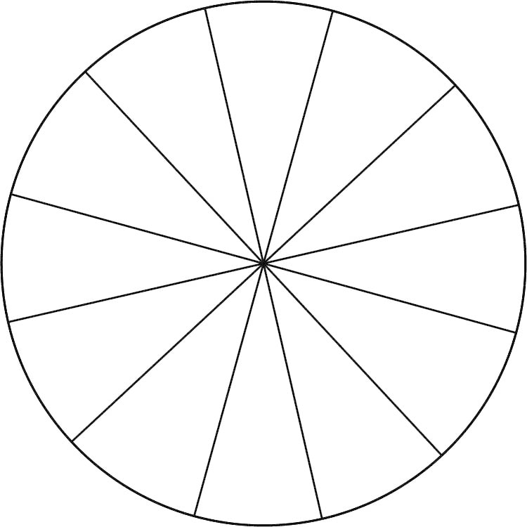
Assignment # 2: Color Wheel
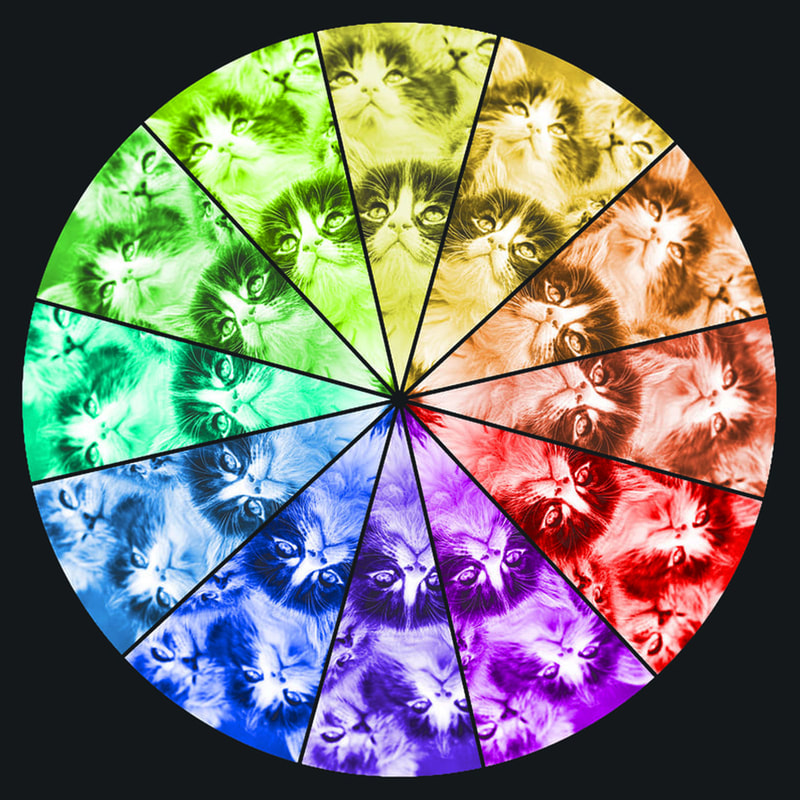
You are to create a color wheel using the template to the right. You will choose an image to place inside the slices of wheel. You will then change the color of that image in the slice to the appropriate color to create a completed color wheel. You are "mixing" colors in photoshop. Tutorial Below: Photoshop Tutorial:
|
| ||
Photoshop Example Below:
|
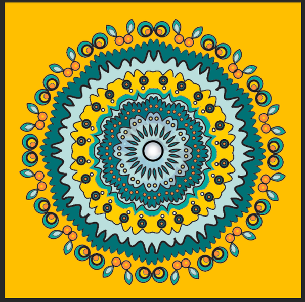
Assignment # 3: Mandala
You are to create a mandala design that you will color in using a color palette of your choice. You will paint in your mandala choosing from these color scheme options:
Choose a color palette that best expresses the title of your mandala. You are drawing the mandala in Adobe Illustrator, then bringing it into photoshop to color it. In the end, you will have 2 colored mandalas. ***you are painting in your mandala twice, so that you can see how color can change the effect on the same drawing*** 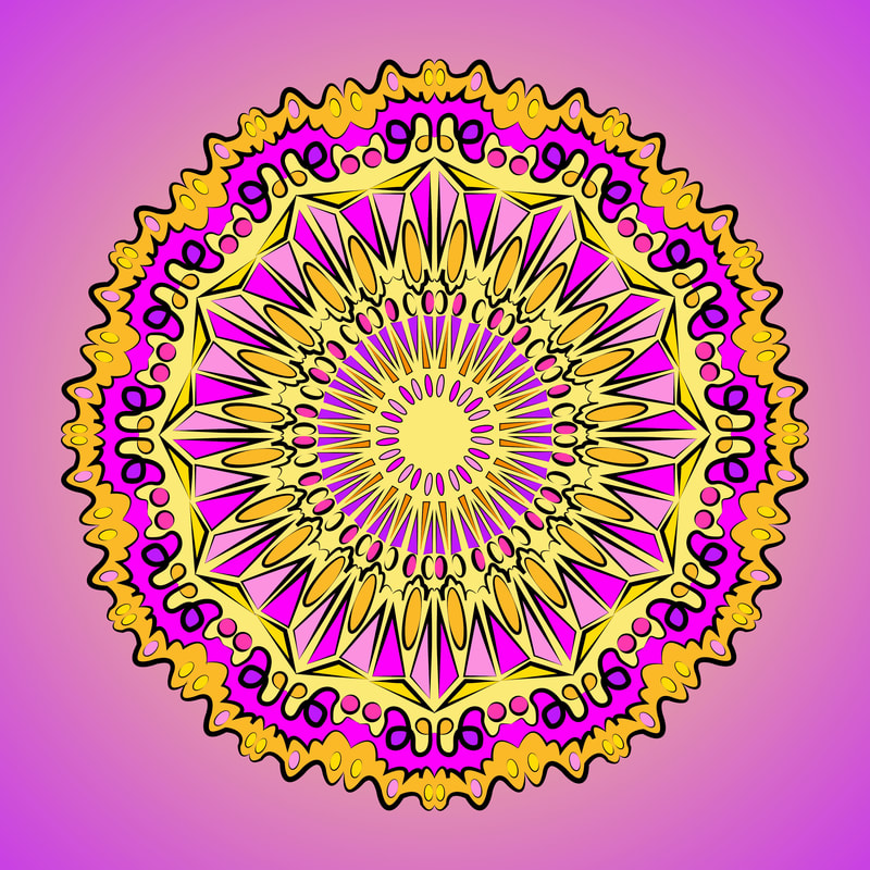
"New Orleans"
|
"Florida Orange"
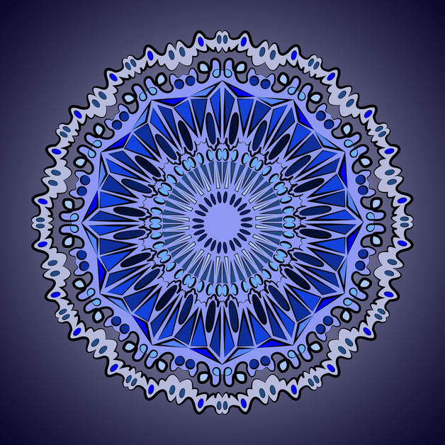
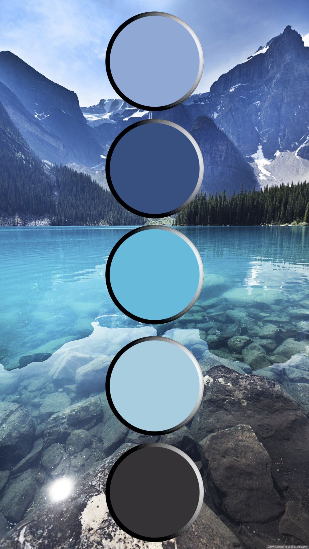
"Tundra"
Tutorial Below:
| ||||
|
Assignment # 4:
Reflection Questions: When you are done with your project, and it is in your google portfolio for grading, answer the following questions in the comment section underneath your slide:
|
|
Swatch Landscapes- only if we are remote!
|
You are going to create 2 swatch landscapes, one cool tone and one warm one.
They must include the following:
Tutorial Below: PIXLR
|
|
|